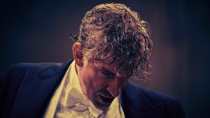
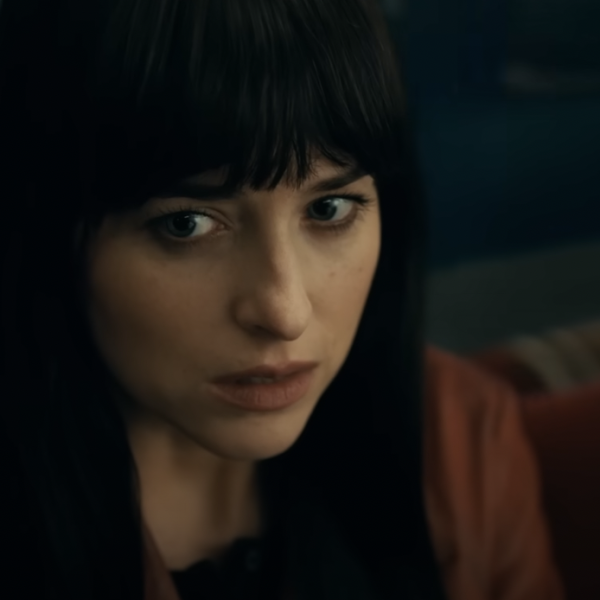
Director Bradley Cooper describes “Maestro” as a series of movements through the life of the legendary conductor and composer Leonard Bernstein and his wife, actress Felicia Montealegre. Precisely because the film seeks to chase a more emotional throughline, every aspect of the filmmaking has to evolve, too. The “Maestro” production team didn’t just need to capture a succession of time periods — although they did need to nail those time periods — they needed to visually dramatize the ever-changing dynamic between Lenny (Bradley Cooper) and Felicia (Carey Mulligan). If you’ll forgive the obvious metaphor, every department head had to move in concert with each other and with Cooper’s vision.
When thinking about how to intuitively make the audience feel the shift into the ’70s, for example, cinematographer Matthew Libatique wanted to create a sense of nostalgia for the era, both because it’s far enough away from our own time to warrant it and because it is the final act of Lenny and Felicia’s relationship. “So I underexposed the stocks slightly,” Libatique told IndieWire. I enjoy the extra texture and more saturation as well. Where it really blends together for me is the color chosen and the palette by [production designer] Kevin Thompson and [costume designer] Mark Bridges.”
There is a warmth to the color choices Thompson and Bridges made as seen through Libatique’s camera in that era, which makes the instances of coldness or washed-out color of what comes later all the more devastating, and the richness and elegance of the black and white sections exploring the Bernsteins’ early relationship all the more alluring. “You’re always thinking of what are we saying about the moment that the character is going through and then what gives resonance to the emotions that are happening onscreen,” costume designer Bridges told IndieWire.
In the videos below, watch how Libatique, Bridges, and Thompson all stayed on beat with each new movement of “Maestro” and made the technical choices that help the audience feel the love that lay behind Leonard Bernstein’s music.
The Cinematography of ‘Maestro’
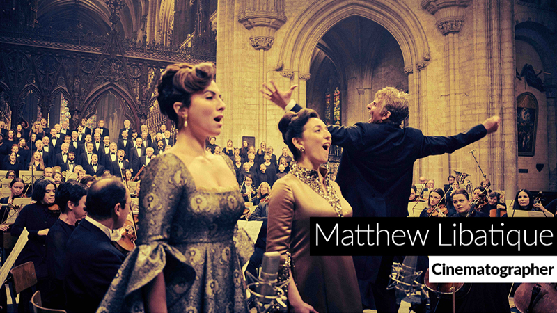
There’s no shortage of video of the real Leonard Bernstein — just ask Lydia Tár. But to prepare for “Maestro,” cinematographer Matthew Libatique gravitated more towards candid photographs of Bernstein and Montealegre, one where neither was putting on a public or performative face. Libatique wanted to capture the strength of their relationship and the natural ease they had with one another. So the director of photography used lighting and even the size of the frame in order to convey Lenny and Felicia as people who found each other and then took on the world together — for the most part, anyway.
“[The square frame] really worked well to isolate them as a single unit within a single frame. What Bradley was trying to create is that these two were trying to get away from everything around them and they were connecting. The idea that that frame is holding these two people in their life, it’s like this snug blanket,” Libatique said. “But then when she passes, it opens up. It’s really meant to display this emptiness without Felicia in this world.”
Without a single word of dialog (or a single note of music, for that matter), Libatique lets the emotional relationship at the core of the film dictate how close, adrift, ecstatic, or cold the camera is. In the video above, watch how Libatique crafted frames that intuitively illustrate both the fullness and the loss throughout Leonard Bernstein’s life.
The Costumes of ‘Maestro’
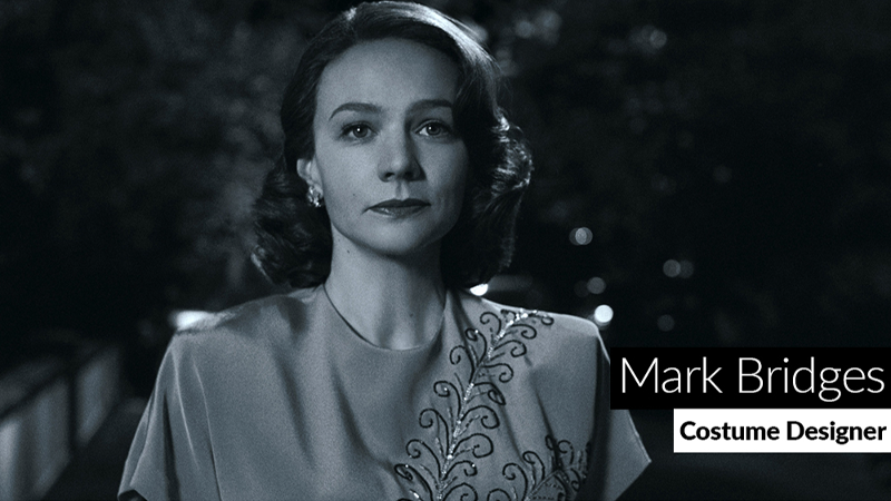
Costume designer Mark Bridges had his own themes and variations that he wove into the costumes for “Maestro.” Bridges injects a wonderful playful sense into the clothes during the stages of the film shot in black and white, with Lenny at his most charmingly rumpled and Felicia at her most shining. But throughout each section, Bridges combines meticulous research into the era and the Bernsteins themselves with an intuitive sense of the key emotion or idea that the characters are trying to project in each scene.
“I used values and contrast and, of course, textures to draw your eye as well as talk about character and make it interesting and fun to look at. Like those very pretty sparkling beads on Felicia’s dress. There’s something special happening. There’s a little bit of magic, and hopefully that little sparkle makes her somehow special in our eyes and his eyes,” Bridges said. “[Then with] the opening of ‘Mass,’ Felicia wears a chiffon gown, but she’s really had it with Lenny and very despondent about her own life, thus the dark color and very covered up. It’s a different mood from the gown in the Ely Cathedral. Once again, she’s using a chiffon gown. It definitely has the feeling of what Halston was doing at that time. It’s a very sexy look. This is hopefully coming back to her man.”
In the video above, watch how Bridges helps us stay keyed into Felicia’s and Lenny’s over the decades and adds a little spark that keeps them coming back to their relationship.
The Production Design of ‘Maestro’
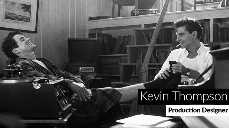
“Maestro” recorded in many performance spaces where Leonard Bernstein actually played, but even when going to the almost 700-year-old Ely Cathedral, production designer Kevin Thompson needed to make key adjustments so that these spaces would have the emotional resonance the film needed and room for the technical requirements of filming. He performed the magic of making sound barriers disappear and building theatrical flats that seemed pulled from the height of ’40s Broadway.
But Thompson was able to kick his designs into an even higher gear when it came to spaces purpose-built for the film, including adding an emotional weight to each of the apartments and houses where the Bernsteins lived. “When they lived at the Dakota, they were getting comfortable in terms of their public life. They had attained something that was grand and had a certain level of wealth to it, and it was laden with their accomplishments. But their life was not happy in those years. It was heavy. So I think that heaviness was felt in the architecture of the Dakota apartment and the thickness of the walls,” Thompson said. “The emotional core of each scene was informing to me about how the set should feel and what it was that we were trying to say with it.”
In the video above, watch how Thompson and his production team build out a physical sense of the joy, chaos, angst, and peace in Lenny and Felicia’s lives together.
READ MORE CRAFT CONSIDERATIONS


