Presented by Adobe, Presenting Sponsor and official editing solution of the 2024Sundance Film Festival. For more information, click here.
“Risk…can be the catalyst that propels you forward” is a quote from Robert Redford that lives on the Sundance Institute website, a fitting message from the festival founder that has a forty-plus year history cultivating the careers of many first time filmmakers. Quentin Tarantino, Robert Rodriguez, David O. Russell, Paul Thomas Anderson, Ryan Coogler, Ava DuVernay, Chloé Zhao, Cathy Yan, and Wes Anderson all made a name during the Park City event.
For the 2024 installation the tradition of directors premiering their debut project continues with over 90 films and episodic titles being showcased for the 40th edition of the Sundance Film Festival. Among them are eight titles whose editing teams looked to Adobe Creative Cloud apps to craft their stories. From an uncertain teen trying to fit in, a grandma on an action-packed revenge quest, a young girl finding her way in the wilderness, to the mysterious disappearance of Mavis Beacon and an a examination of consciousness in AI, the storytellers below share the challenges they were up against and the steps they took to propel the narrative forward.
Premiere Pro is again the most popular video editing software at the 2024 Sundance Film Festival, used by more than half (57%) of premiering films. And Adobe Creative Cloud tools were used in over 80% of this year’s submissions overall.
“Between the Temples”
U.S. Dramatic Competition
Director: Nathan Silver
Editor: John Magary

Jason Schwartzman and Carol Kan star in Nathan Silver’s latest project “Between the Temples,” a story about healing emptiness with friendship. The two actors play Ben and Carla whose paths cross once again after she reenters his life as his adult bat mitzvah student. Their growing connection becomes the heart of the film. “What really stands out to me is the mutual need between Ben and Carla, a need which goes relatively unspoken,” editor John Magary told IndieWire. “ At first, they’re just two adrift strangers hitting it off, but as the movie goes on, we get more and more invested in—and hopefully more and more delighted by—their peculiar, deepening friendship.”
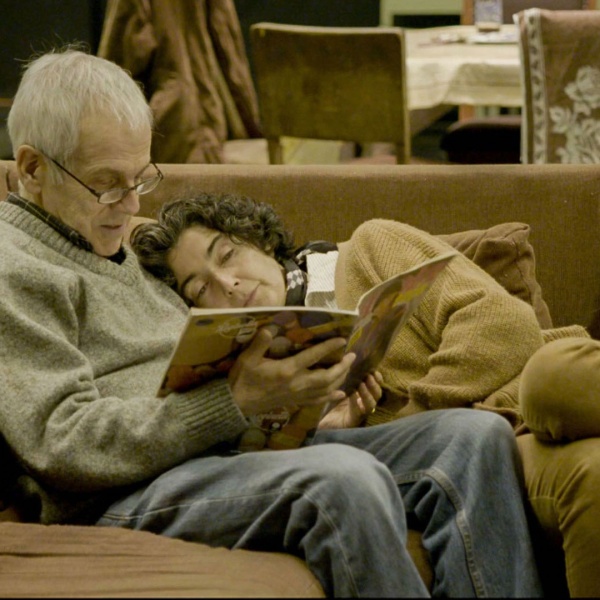
In preparation the director and editor spoke about “Harold and Maude” and “The Graduate” as reference points. “I love the predominant editing style of the late 1960s to early 1970s. Hard cuts, angular sound transitions, foregrounded music cues. A little bit Altman, a little bit Godard. So I guess my vague initial concept for the edit was the ‘60s. I didn’t go in with much more than that. I just wanted the movie to move and, if possible, to reorientthe viewer,” said Magary.
In creating the chemistry between the characters, the editor mined the details of their performances. “Jason and Carol are both of course very funny actors and gifted improvisers, and they played off each other so well on set, so my job was to capture those little peculiar bolts of lightning,” said Magary. “Rhythm was one of my main concerns. How to make these conversations between Ben and Carla, often peppered with loose improvisation, move in a way that conversations move between two people who instantly hit it off but not necessarily in a romantic way.”
For a scene when Ben’s faith is being tested by a priest played by Jason Grisell, Magary combed through a number of improvised takes. “I tackled it almost like a documentary scene. I pulled selects of my favorite moments, and then assembled it together into a radio edit. Basically, my challenge was to utilize a documentary workflow in order to make a short, effective, fully coherent scene out of a lot of very loose conversation. And it ended up being one of my favorite scenes in the film!”
“Dìdi (弟弟)”
U.S. Dramatic Competition
Director: Sean Wang
Editor: Arielle Zakowski

Editor Arielle Zakowski was “blown away by the laugh-out-loud humor nestled in the immense yet sensitive heart” of first-time director Sean Wang’s “Dìdi (弟弟),” an authentic look at a first-gen Taiwanese American navigating teenage life circa 2008 when MySpace, AOL Instant Messenger, and flip phones ruled. Early on, the first-time collaborators discussed the emotional pace of the main character nicknamed Wang Wang (Izaac Wang) and how they wanted to contrast his “chaotic, testosterone-filled energy outside life among friends, and the quiet, almost painfully slow world of his life at home.” “We wanted to create a tension between these two environments so that Wang Wang never quite feels like he fits in anywhere, a reflection of the fish-out-of-water struggles of a young teenager struggling to find his place in the world,” Zakowski said.
The visual glue holding Wang Wang’s social miscues together is a grounded reality, one that blends an alluring yet almost homemade quality to it from cinematographer Sam Davis. “The ways the characters talk to each other a la 2008-era-slang, how a mother and child communicate with each other in two different languages, how each person behaves in rare moments of solitude – all of this is meant to feel very natural and true to the time and place,” noted Zakowski.
To hurdle one of the cutting room challenges in a scene where Wang Wang shows up at a park for a teenaged fight club, Zakowski leaned into a “less is more approach” while editing in the Adobe ecosystem. “There were lots of lines spoken between the characters and a whole mini plot playing out within the scene, but every time we watched it we felt like the scene didn’t quite have the energy we were looking for. Then one day we tried dropping in a wacky song and stripping out almost all the lines, leaving it essentially as a pile of chaos, and we were like, dang… I think we found something here! We honed and trimmed from there but basically ended up leaving the scene in its nearly nonsensical form. The hope being that after it plays, viewers are left with a bit of, ‘Wait… what the hell was that?!’”
“I Saw the TV Glow”
Midnight
Director: Jane Schoenbrun
Editor: Sofi Marshall

In bringing writer-director Jane Schoenbrun’s film “I Saw the TV Glow” to life, a story about a suburban kid named Owen (Justice Smith) obsessed with a late-night TV show, editor Sofi Marshall tuned into the internal conflict of the character. “He’s a quiet, shy kid who’s trying really hard to avoid knowing himself, scared of what he might find. One of my goals in the edit was to try to make his emotional journey as external as possible so that the audience has the opportunity to deeply connect with him. Tactically, that looked like pouring through the footage, searching for the perfect facial expression or line delivery, or drafting and redrafting Owen’s voice over to deliver just the right amount of information.”
It was also important for the editor to encapsulate Owen’s journey through a lens of honesty, even in moments that are painful to watch. “Ultimately, “I Saw the TV Glow” is about a kid who’s uncomfortable in his own skin. We talked a lot about our own childhoods, particularly about how growing up in the suburbs doesn’t exactly offer misfit kids any support. We also talked about our shared nostalgia for ’90s media and how to tease that out in the film through some fun callbacks,” said Marshall.
Finding the right pace for several montages meant to pass time as Owen ages created an obstacle for Marshall. “It took a lot of back and forth to strike the right balance between focusing on the emotional quality of the montage and the story points that we needed to convey. Add nailing the rhythm and pacing on top of that, and we had a ton of moving pieces that needed to be massaged into a single, cohesive sequence. Ultimately, we allowed ourselves plenty of room to play, going back and forth on including, cutting, or trimming shots over and over again until Jane and I felt we had pretty much tried everything.”
For Marshall she immediately connected with the character growing up in the suburbs. “The film taps into so many painfully relatable moments from my own childhood, all while beautifully capturing the nostalgia of the ‘90s. Owen’s story plays like a memory at times, feeling so familiar that it almost feels like watching myself up on screen. I hope audiences will have the same experience.”
“Little Death”
Next
Director: Jack Begert
Editors: Jake Torchin, Tyler Sobel-Mason

In the visually punchy film “Little Death” from Jack Begert – better known for directing music videos for artists like Doja Cat, Jack Harlow, and Kendrick Lamar – David Schwimmer plays a screenwriter in the midst of a midlife crisis. The story takes a turn when two taco truck owners (Talia Ryder and Dominic Fike) are looking for their next opioid fix. Editors Jake Torchin and Tyler Sobel-Mason have been working with Begert for over a decade and knew going in that “Little Death” would “intentionally use different styles in different parts of the film.”
“At times, the cutting tends to be in your face with an array of postmodern, hyper stylized sequences. Other parts become more slice of life, where our job was to hide the edit. Ultimately, this was reflective of the contrasting perspectives of our characters,” Torchin told IndieWire. Sobel-Mason added, “We knew that there would be a pacing shift in the movie and that the story and structure were going to be experimental. We were able to play with the structure a lot in the edit and utilized a combination of stock footage and AI animation to glue certain sequences together.”
Footage was shot by cinematographer Chris Ripley using digital and 35mm film which helped to guide the structure of the edit. “Looking at some of the choices Jack and Chris made about framing, there are only maybe one or two wide shots in the first 40 minutes, and as things begin to change, almost every scene has a wide,” said Sobel-Mason.
Visual effects became an integral part of the story and were created simultaneously along with the edit. The pair integrated Premiere, After Affects, and Photoshop for their offline cut to push the “limits visually and thematically.” Having a single film with different cutting styles presented unique creative challenges. For example, there’s a portion of the film that plays very linearly, which allowed us to take a more traditional approach. But there’s another portion of the film that is a total jigsaw puzzle – where the scenes didn’t necessarily have to play in one specific order. So as part of the process, Jack would have us completely deconstruct a scene and try it every possible way – except the way it was written and shot,” said Torchin.
“Love Machina”
U.S. Documentary Competition
Director: Peter Sillen
Editor: Conor McBride

“When you’re making a film about technology it’s easy to get into the technical and scientific weeds. It was important to director Peter Sillen to make sure this film stays, at its heart, a human story,” Conor McBride told IndieWire of “Love Machina,” a documentary that poetically intertwines love, humanity, and AI. “We cover a lot of ground in this documentary: robotics, transhumanism, transgender rights, bias in AI. Despite all these topics, Peter wanted to open up the film up at points, slow it down and have these lyrical moments.”
The layered story follows futurists Martine and Bina Rothblatt and how they transferred Bina’s consciousness into an AI named Bina48 to preserve their love life for years to come. “Our film started out as a story about a robot going to college but has since ballooned into a tale about eternal love,” said McBride. “Our protagonists are passionate about making technology with human compassion. Equally our film wants to focus on human values and ask the audience how we can preserve our humanity with the growth of technology and artificial intelligence.”
In shaping the story, McBride leaned on Adobe Premiere Productions to create an “effortless workflow” between him, additional editor Ben Mercer, and the director. “Whether we were in different states or just in different rooms in the office we could pass selects and scenes between each other seamlessly,” McBride said. The production pipeline was especially useful in finding the film’s climax. “We have had a variety of endings for this film. When you’re telling a story about the future, the conclusion is in itself inconclusive because no one knows what’s going to happen,” he said. “Peter and I, having worked on the film over a few years, were in a rut as to how to wrap the film up. We had the great opportunity to work with Brian Kates as a supervising editor in the past 6 months. He helped guide us through a mood shift and clarified the message for the film’s conclusion.”
“Penelope”
Episodic
Director: Mel Eslyn
Editor: Celia Beasley

Directed by Mel Eslyn, “Penelope” follows a 16-year-old girl (Megan Stott) disconnecting from society to find a new meaning in the wilderness. While the episodic series shares shades of Reese Witherspoon’s “Wild” on the surface, its roots in terms of tone, pacing, and subjective viewpoint, stem from Lynne Ramsay’s psychological drama “Morvern Callar.”
“The series brings us deeply into Penelope’s experience,” said editor Celia Beasley, whose work includes the award-winning documentary “Yes I Am: The Ric Weiland Story,” which follows the philanthropy and personal struggles of the Microsoft programmer. “As a viewer, we are with her all the time, watching her or seeing what she is seeing, like a mouse on her shoulder. At times we actually go inside of her head to live her experience without any separation, almost like an alternate consciousness, where thoughts are nonverbal, atemporal, and asynchronous.”
Cinematographer Nathan Miller photographed certain moments with a bespoke style and finding the precise transition points was key to the edit. “Some of these moments were shot in high speed, so it gave me a lot of flexibility in the edit to use time remapping to explore the transition between the various levels of Penelope’s consciousness. I also used score and sound design to emphasize that shift, which included establishing dialogue as asynchronous to the world around us,” she said.
Music was also crucial to the edit. “Mel gave our team a lot of creative freedom to go out and explore all kinds of different temp music to shape the tone. We experimented with acoustic folk, electronic music, ambient soundscapes, non-verbal vocalizations, and even mainstream pop. Trying all these different options allowed us to be receptive to when something really did connect.” For a pivotal scene that sees Penelope sneak onto a moving train, the editor paid meticulous attention to the passing world. “It was shot very simply and beautifully with just a handheld camera by Nathan. Because the train was an actual working train, the footage reflected the passing environment as well as the changing light. It was challenging to cut the scene and maintain a logical progression of landscape and light, but it was so worth it because of the beautiful tone it creates in this moment.”
“Seeking Mavis Beacon”
Next
Director: Jazmin Renée Jones
Editors: Jon Fine, Jazmin Renée Jones, Yeelen Cohen

Mavis Beacon launched in 1987 teaching millions of people how to type. However, the Haitian-born model gracing the cover, Renee L’Esperance, disappeared years later. Enter director Jazmin Renée Jones, who along with co-investigator Olivia McKayla Ross, turn the cameras on themselves in search of the missing icon. For Jones, she was “simultaneously intrigued and dissatisfied” with the information she found online about the missing woman and used the film as a tool to “research Mavis Beacon’s origin story while paying homage to all of the Black visionaries, artists, and technologists” who inspire her.
The first two years of production the team spent documenting the investigation. “Jazmin had a strong vision from the start and emphasized a desire for world building. From the hours spent perfecting the investigation headquarters, to collecting posters and retro tech paraphernalia, to the colorful coordinated outfits, she managed to create a cohesive aesthetic for the film,” said Yeelen Cohen, who co-edited the film with Jon Fine and Jazmin Renée Jones.
To jumpstart the edit, Fine curated a chronological assembly which helped the shooting process along. “Because the mystery was still being explored, we dove into whatever footage felt emotionally compelling while also searching for the nuggets that seemed like they may help solve the mystery embedded in the film,” noted Fine. “Once we felt sure of the destination, the film’s language really congealed.” Helping to drive the narrative were transitional sections or what the trio called “desktop montages.” “The desktop montages allowed us to further unpack themes that were brought up during interviews, in addition to planting ideological Easter eggs in the form of memes, manifestos, and viral videos,” noted Jones.
For the team, the first 20 minutes of the movie was the biggest obstacle. “It was challenging to establish the characters, the search, and the location without rushing through it all,” said Cohen. “Most notably the first mapping scene when Jazmin and Olivia get into the detective work. We wanted it to feel like the audience was in the room with them as they were putting the pieces together. Every editor gave it a pass and it ended up being a true amalgamation of each version.”
“Thelma”
Premieres
Director & Editor: Josh Margolin

“I always loved action movies,” said Josh Margolin, the writer, director, and editor of “Thelma,” a cleverly entertaining film that sees actor June Squibb play a 93-year-old whose been duped by a phone scammer and stops at nothing to avenge what’s taken from her. The story, inspired by an experience from Margolin’s own grandmother, explores themes of independence, tenacity, and aging through a prism that references the action of “Mission: Impossible” and the emotional palette of “Punch Drunk Love.” “There’s so much feeling and anxiety in the way that movie is shot. We were looking for ways to take visual ideas from big action movies and shrink them down to an everyday scope and scale. We wanted it to feel intimate and human but be able to evolve into something exciting and dynamic,” said Margolin.
For action sequences, Margolin didn’t want a physical feat to be the focus of the joke. “It was important to me for the action to have stakes and be treated with sincerity. Because Tom Cruise jumping out of a plane is thrilling but so is watching my grandma jump onto a high bed. Both can be harrowing for the participant,” said Margolin. “June actually ended up doing a good deal of her own stunts with the support of our awesome stunt team so that was also very inspiring in terms of wanting to showcase her as much as possible.”
In editing a climactic cut chase sequence, Margolin found ground in serving the story. “Because it’s a mix of genuine tension and comedic beats, it took a while to actually find a length that could support both without losing steam,” he said. “I think getting feedback, then returning to it with fresh eyes ended up being really fruitful. It just takes time. You end up killing some darlings but it definitely feels worth it in serving the bigger picture.”
The director hopes audiences will connect with Thelma’s fight for autonomy and self-worth. “I think that’s something that we all go through multiple times in life – growing up, getting older, we’re constantly renegotiating our sense of self. And seeing June Squibb take matters into her own hands and fight back when she feels she’s been counted out should be fun and cathartic.”
