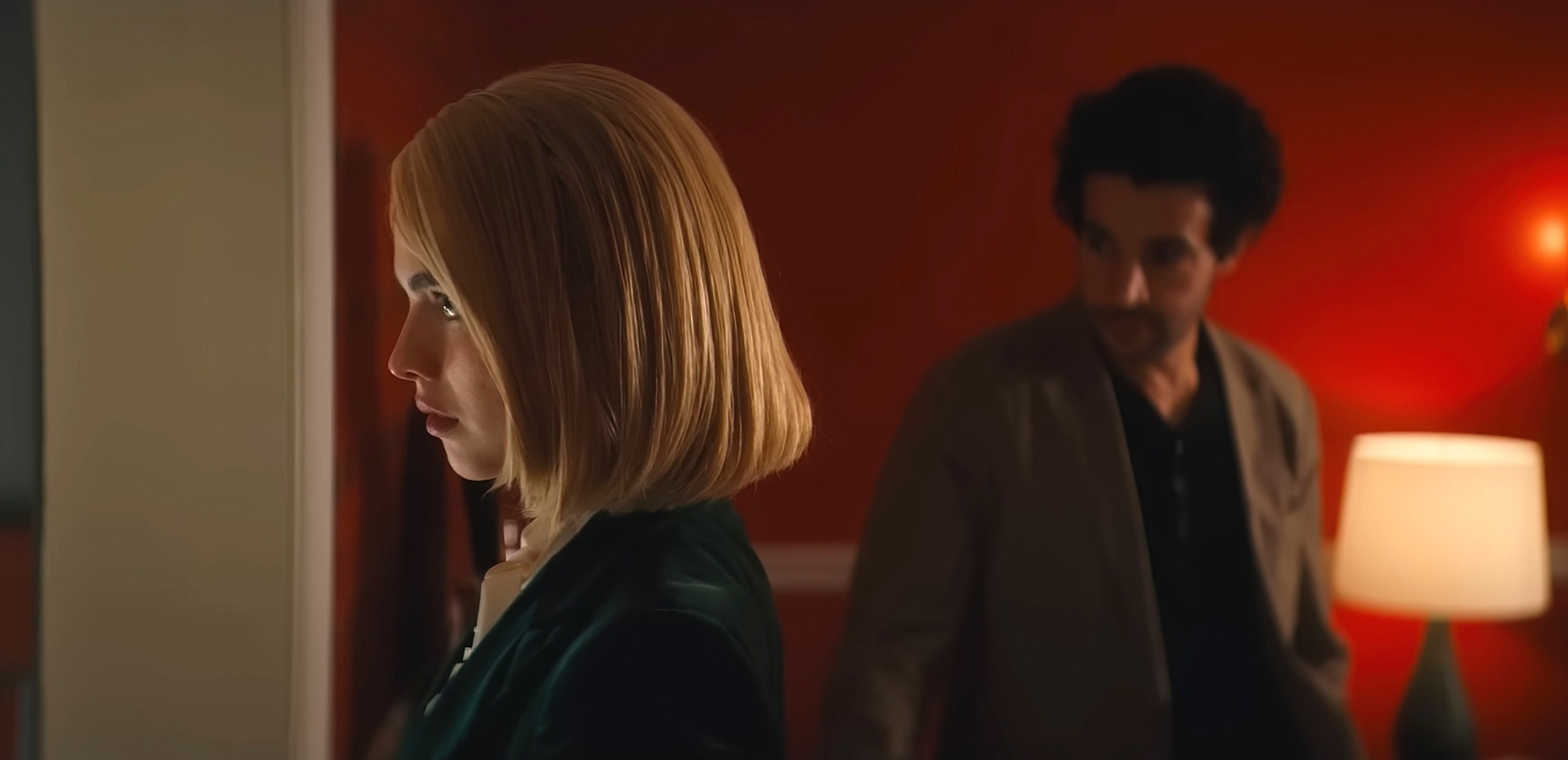
In “Sanctuary,” an heir to a hotel chain (Christopher Abbott) and the dominatrix (Margaret Qualley) he pays to act out his submissive fantasies shift into a real-world power struggle when the client wants to end the relationship. The entire film takes place within the confines of an upscale hotel room (with a quick detour into the hallway and elevator), but this is no filmed stage play; director Zachary Wigon and cinematographer Ludovica Isidori’s gorgeous and meticulously conceived visual style makes “Sanctuary” a gloriously cinematic experience that’s as dynamic as it is provocative. Every expressive possibility is seized upon and explored, as Wigon and Isidori consistently find rich visual corollaries for the characters’ internal tensions and shifts in dominance. The movie expertly maximizes the limited resources of an independent film, so IndieWire reached out to Wigon and Isidori to get their tips on how to make the most of space, time, and money.
Keep the visual language evolving throughout the film
One reason “Sanctuary” never becomes boring is that Wigon and Isidori refused to repeat themselves as the film progressed. “In the script, there aren’t any repeating beats,” Wigon said. “Every beat in the story is different in some way, and you’re never in a place that you were earlier in the film. What you’re doing as a director is taking those beats and translating them into cinematic terms with camera movement, blocking, staging, composition, music, and color. By that principle, if every beat is different on the page, then there’s no reason that you should ever be repeating yourself cinematically in your translation.”
Early on Wigon and Isidori discussed the fact that the script had several movements that lent themselves to a subtly different visual style. For the opening section, in which the two characters are role-playing according to a predetermined script, Wigon kept the coverage static. “Because they’re trapped and locked, the camera is trapped and locked,” he said. Once the dominatrix departs from the script, the camerawork shifts to Steadicam. “It’s all free-floating because now everything is up in the air. What’s going to happen? Everything is confusing and things are shifting.”
Later in “the film”Sanctuary,” when the characters seem to be spiraling, the camera spins out of control with them. “That was the only scene in the movie I didn’t shot list or block,” Wigon said. “It’s just one shot that goes on for about two and a half minutes, and I just told Margaret and Chris to roll with the blocking and the camera operator went handheld and followed them around. And that was right for the feel of that particular sequence, which I wanted to seem particularly unhinged, like anything could happen, like we were off the rails.” This approach extended to every scene in the movie, as Wigon created not only a narrative but a visual progression. “You’re basically trying to read what’s different about each sequence and then go as far as you can stylistically in a way that will support what’s going on. You never want to repeat a frame because as soon as you do, the viewer’s eye starts to say, ‘I’ve seen this before.’”

Plan ahead as much as possible
The precision of the blocking and camera placement in “Sanctuary” is the result of planning and rehearsal, even though Wigon didn’t have much access to his actors ahead of time. “It’s an independent movie, so there wasn’t a lot of time for rehearsal,” Isidori said. Since the actors weren’t available, Wigon and Isidori spent their evenings before production creating a video shot list with whomever they could enlist to stand in for Abbott and Qualley: production assistants, friends, even Wigon’s siblings. “We did it with a phone, just to make sure the editing was working,” Isidori said, adding that they also worked out an overall philosophy for how the characters would move: with a sort of heightened reality motivated by the emotions. “It has a theatricality to it, which is fun as long as it’s in character. We wanted to make sure we were always riding that line and never forcing the movement so that it didn’t make sense. Obviously working with Margaret and Chris there were adjustments on set, but a lot of it was predetermined shot listing night after night with random people.”

Create a visually interesting space
In keeping with the movie’s sense of heightened reality, Wigon and production designer Jason Singleton conceived of a hotel room set that was more visually diverse than what one would probably find in an actual hotel suite. “There are a lot of contemporary hotel suites where everything is beige,” Wigon said. “That can look nice in real life, but it would be quite boring to look at that for 90 minutes.” Wigon came to Singleton with a concept of the hotel room that had what he described as a “strikingly busy” interior design. “Jason said, ‘We can do something in this universe of busyness, but we’ll need to dial it down by about 20 percent or it’s going to be too much, it’s going to overwhelm the eye.”
Isidori collaborated closely with Singleton to control the color in the set and use it as a storytelling tool. “There are two types of color: There’s the color of the room and the color of the lighting,” Isidori said, noting that she carefully controlled both to add further dynamism to the imagery. “The first time you get to the bedroom, it’s warm red tungsten light. The second time there’s a lot of green, which is technically coming in from the outside, but it doesn’t matter where it comes from — the point is that anger and turmoil are bubbling up. The characters are becoming rougher and more unraveled, so I brought in that green to give you an uneasy feeling.” Isidori also did subtle things with the color of the light to underline both differences and connections between the characters. “In the first bathroom scene, they occupy two worlds and their lighting doesn’t necessarily match, but it’s complementary. There are scenes where one character is in blue and the other is red, but there will be a little red in the blue and a little blue in the red, like the colors are leaking into each other’s frames — the colors are contaminating each other.”
Save your biggest camera flourishes for when they count
Although the camerawork never gets in the way of the performances and story, “Sanctuary” does have a few extremely self-conscious shots that make the audience aware of the filmmaking — and that was entirely intentional. “We were not pretending to make a naturalistic movie,” Isidori said. “We’re not pretending the camera is not there. Sometimes it’s going to call attention to itself if it helps support the narrative.” According to Wigon, the more audacious devices — like a shot where the camera inverts, travels from one character to another, and then sets itself upright again — were saved for big dramatic shifts. “You have to pick your moments for fancy business, and usually it’s when you’re delineating new movements in the story,” Wigon said. “Turning moments lend themselves to that kind of stylistic flourish because one chapter is coming to a close and another chapter is opening, and the flourish is a nice way to signify that for the audience.”
