Midway through shooting the massive, futuristic “Megalopolis,” Francis Ford Coppola knew it wasn’t working. In the production notes, he recounts how the art department (led by production designer Beth Mickle) wasn’t in sync with his abstract vision wrapped around the deteriorating New Rome and the utopian Megalopolis. The concept of conveying “woven material or tapestry” just wasn’t getting through.
So Coppola started communicating his bold visual ideas to concept designer Dean Sherriff through stick-figure sketches. Before the 2022 holidays, he demanded that the art department trim its leadership to perform more efficiently out of budgetary necessity. They refused and quit in protest. Meanwhile, the VFX team was disbanded as well.
Enter production designer Bradley Rubin (“The Mandalorian,” “A Star Is Born”) after the New Year’s break. He was tasked with completing the film in collaboration with a whole new VFX team (production supervised by Coppola’s nephew, Jesse James Chisholm, a Marvel vet). Yet he quickly adapted to the theatricality of it all (movable sets, no ceilings, being flexible) and the use of metaphors such as controlling time as states of mind.
“Francis had all of these deep multi-layers going into all of this, outside of just being visually striking as an image,” Rubin told IndieWire. A perfect example is the scene shot in the LED volume at Prysm LED Stages, where architect Cesar (Adam Driver) and his girlfriend, Julia (Nathalie Emmanuel), stand on a giant clock high above the city.

“Why is there a clock facing the sky? And who is reading that clock from the sky? It’s a metaphor for time. And does time stop when you fall in love?” Rubin said. “There was another fun bit when Francis had an entire layer underneath all of this scenery that was suspended 20 feet high or so in the air. Underneath those beams, traditionally, would be stunt pads or airbags, or the actors would be wearing wires. But Francis wanted the actors to sincerely fear falling, so there were no wires on any of the actors. He didn’t want the stunt pads for them to feel safe.
“So, in his mind, trapeze netting was the best way to do it because he had his kids do trapeze training when they were young. And so we hired a circus crew to come and rig this trapeze netting underneath all of this. And then told the actors how to basically fall into trapeze netting.”
Speaking of the circus, the depiction of Madison Square Garden was made to look like a Roman gladiator blood sport of politics, money, and sex. “I think all of Madison Square Garden, in a way, is a big metaphor that is truly the circus of what New Rome is with all of the social classes and the economic classes all coming together,” added Rubin. “And you read the metaphor of current politics, from the people wearing what look like MAGA hats, carrying flags and running in and trying to take over.”
While Mickle’s team designed several pieces, including the glam Crassus (Jon Voight) box and laurel mural, Rubin oversaw many elements and moving pieces, which had to be integrated into the main action shot in an arena near Atlanta.

“I think it was a monster truck event,” he continued, “where they were going to leave the dirt down in the arena for us to be able to then film the actual horses going around, and do some of the wrestling inside those spaces, and the whole musical performance of Grace [VanderWaal] there on the platform. It was really a true integration of visual effects of lidar scanning the arena and tying it into the stage build elements of [luxury] boxes, and then the whole underbelly of Madison Square Garden.”
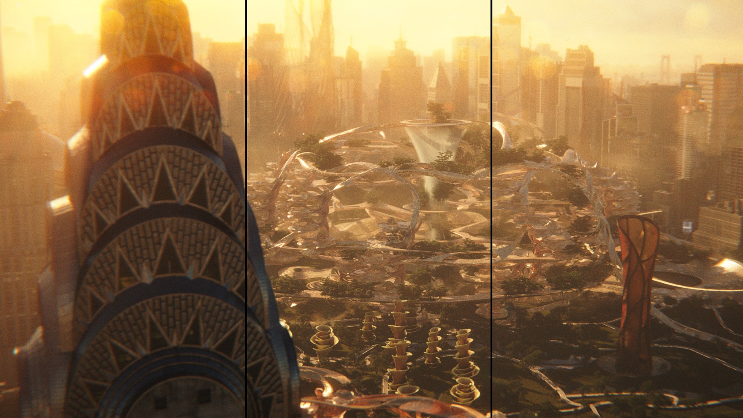
But Rubin’s primary focus was the futuristic-looking Megalopolis open-air set (shot at Trilith Studios), powered by Cesar’s revolutionary bio-adaptive building material called Megalon. This was the glowing, translucent, yellow substance that transforms the new urban development with organic shapes and lots of flora and fauna. Megalon, though, was handled by VFX as set extension during post.
“A lot of [Megalopolis] was influenced by Neri Oxman, the scientist and bio-designer [who appears in the film],” Rubin said. “It was my understanding that Francis hired her in 2010 when he was trying to rethink this film. And she did this beautiful study on how an organism starts and would spread into more of a leaf structure or a plant structure, and really growing and germinating from that into [urban planning].”

But when Rubin came aboard, Coppola started to lean away from the biological design into more of the shape language where modern architecture is headed (prismatic, rigid, linear). “So, I think, throughout this film, Francis struggled, and he’d be the first to tell you that it’s more about the idea of what Megalopolis is,” added Rubin. “And I think, for him, knowing he had to create a visual, he found himself back towards what Neri had started: the flora and the fauna and basically applying photosynthesis to architectural design.
“And the material Megalon itself, in many ways, was just something to push the story along in my own mind,” Rubin said. “It’s this magical, perfect thing that becomes an instrument of the imagination. I think what helps sell it is when Julia is imagining it and walking through the cardboard-shaped fake version, and it’s raining and coming over her. And I like the idea that it’s alive, co-existing, becoming part of human society, bending to it or maybe thinking on its own, just a positive, more integrated future.”
