After their mind-blowing “Spider-Man: Into the Spider-Verse,” Oscar-winning producers Phil Lord and Chris Miller break even more animation rules in “Across the Spider-Verse,” the second installment in Miles Morales’ three-part journey about becoming the most creative and individualistic Spider-Man. (“Beyond the Spider-Verse” will be released March 29, 2024.)
In “Across the Spider-Verse,” which the producers call their “Empire Strikes Back,” Miles (Shameik Moore) travels through several multiverses with love interest Gwen Stacy (Hailee Steinfeld) and Spider-Society (led by Oscar Isaac’s Miguel O’Hara) to prevent the destruction of their worlds by Spot (Jason Schwartzman), who traverses time and space through inter-dimensional portals on his body.
The producers began discussing the sequel with screenwriter David Callaham (“Shang-Chi and the Legend of the Ten Rings”) during the completion of “Into the Spider-Verse,” and he provided a whole version of a slightly different story. “But a lot of the ideas that he came up with are in this picture and actually even more in the next,” Lord told IndieWire.
“But once the first one was finished,” added Miller, “then we came together and started to figure out what was really important about Miles’ journey and how we could tell a really satisfying story that would be as emotionally resonant as the first one, but take us to a bunch of new places.”

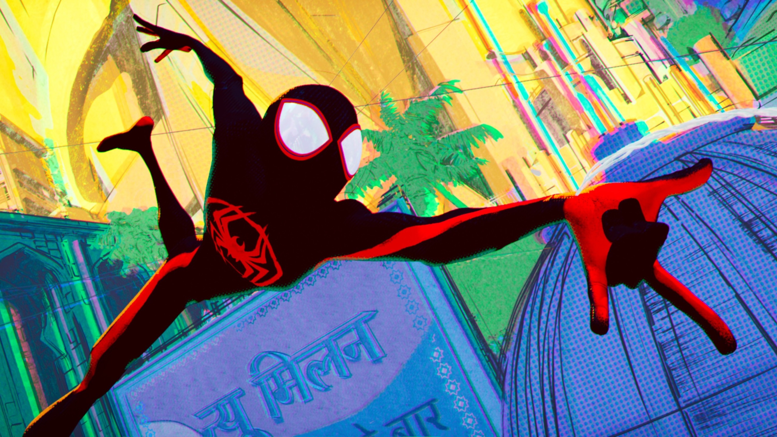
These new places comprise the aesthetically audacious world-building of “Across the Spider-Verse,” which far surpasses its game-changing predecessor. There’s Earth-65, where Gwen’s Spider-Woman hails from, designed to look like watercolor paintings; Earth-50101, home to Pavitr Prabhakar (Karan Soni), based on the Spider-Man India comics, which they dubbed “Mumbattan”as a mash-up of Mumbai and Manhattan; Nueva York, the futuristic world from Marvel 2099, where Miguel lives; the rebellious New London, inhabited by Daniel Kaluuya’s Hobie, the Spider-Punk; and a nightmarish world whose identity will remain spoiler free.
“We like to celebrate when things don’t match,” Lord said. “Some people don’t like the work to have no seams, to be sanded down, and have no edges. I think, for us, the edges are the joyful part of it. And from an animation standpoint, obviously, our whole career we’ve been trying to push American studio animation into more radical places. And, for us, it’s an opportunity to showcase how limitless the possibilities are. And this story begs for it because you’re going to all these different worlds, and each one can look like its own bespoke animation style and have a reason to look that way.”
And Miles serves as the perfect creative muse for the producers: a restless, artistic teen who believes anything is possible in charting his own path. “Miguel says being Spider-Man is a sacrifice,” added Lord. “That’s what we love about this character, that their obligation to the heroism is always compromising their personal happiness. It’s something we can relate to, and it’s something that makes these stories really rich.”
Yet this sequel was a tremendous undertaking, requiring two stories to complete Miles’ journey and a whole new set of tools and techniques from Sony Picture Imageworks. Three new directors joined the team to provide fresh voices: Joaquim Dos Santos (“The Legend of Korra”), a specialist at action choreography; Kemp Powers (the “Soul” co-director and Oscar-nominated screenwriter of “One Night in Miami”), who sharpened both the cultural authenticity of Miles as a superhero of color and the universality of his coming-of-age story; and Justin K. Thompson, the production designer of “Into the Spider-Verse,” who brought great leadership in harnessing the expansive world-building.
If “Into the Spider-Verse” broke the Imagework pipeline in creating a moving 3D comic book, then “Across the Spider-Verse” broke it again, five times over, with an unprecedented crew of 1,000 artists and technicians. Only this time they had a slew of Marvel comic book designs and some of the original artists to help guide them in translating the very specialized 2D looks into 3D animation.

Gwen and her world required a new watercolor and mood ring simulation tool. “There were a couple of programmers that were a humongous part of our crew,” Miller said, “whose job it was to facilitate all this stuff. It’s easy to say the world should drip away and the color should change around her as her mood changes. But someone had 18 months of R&D to figure out how to teach the computer to paint it.”
Meanwhile, the look of Mumbattan embodied the Marvel India comics of the ’70s that were made with exotic inks and offset-printed so the colors crossed the lines. “You really feel the quickness of the artist drawing, and we wanted to represent that because, if you go to Mumbai, it moves fast and there’s a lot going on,” added Lord. “And we wanted that immersive feeling out of that technique. Luckily, we figured it out in time for the film‘s release, but barely.”
Although we only get a brief glimpse of the ’70s punk scene in New London, it’s based on poster collages. “Homemade, torn and cut, and the idea that [Hobie’s] a walking collage,” Miller said. “But how do we render this in three dimensions?” added Lord. “How do we take the information that we have and then sort of photograph it, photocopy it, distort it, and move it around and have it change, but not have your eye get lost or confused? It comes down to the lighting artists because the solutions to each shot cannot make it look like the shot before or after. They have to be bespoke to that one shot. And they have to emphasize the unusual qualities of each shot in each environment.
By contrast, the look of Nueva York, partially inspired by the neo-futurist illustrations of Syd Mead (“Blade Runner”), contained beauty bumping up against brutalism. “The trick there was how to get the markers to look right without being totally distracting, like 12 frames a second of a million squiggles,” Lord said. “The thing that you love about that concept art from the ’80s was a lot of it’s drawn on top of boards that are not always pure white. And some of it is light over dark…there’s negative space under the drawing, but it hasn’t been finished yet.

“And you can see the lines on Miguel,” he continued, “like the pencil is unfinished. It’s kind of a cruel joke on Miguel, who’s essentially asserting that the future is written, but the image is constantly undermining his argument and saying, in fact, the future is not completely fleshed out.”
Then there’s nemesis Spot (scientist Jonathan Ohnn), who alone required 17 new tools. He evolves throughout the film, going from a rough drawing to a fully formed character, with each ink drop in his body looking and behaving differently. However, the idea for him as the supervillain came from Marvel Studios’ founder Avi Arad after much resistance from the producers, who thought he was out of a Looney Tunes cartoon.
“When Avi first suggested it, we ignored him for too long,” Lord said. “We thought, ‘That’s the dorkiest villain,’ but he said, ‘No, his power’s actually way more powerful than anyone realizes.’ And then we thought it was thematically very interesting. It’s kind of funny to take a villain who seems like a joke and feels left out and alone the way that Miles does, and they’re going on a similar journey, but his is the darker path. He’s trying to fill a hole in his heart with more holes.”
The artists and technicians made Spot look like a moving, constantly changing environment. They drew him in blue and inked on top. And then the blue disappears during the printing process. “But in our movie, we wanted to see it and then the spots themselves,” Miller said. “The animators control the spots, but then they had to go through VFX to have the sort of roiling.”
Lord added that it was like oil on glass meets spilling ink into a fish tank with dry erase marker and wax pen on top of it. “It has this overwhelming style,” he continued “Once he takes fully engaged form, that was its own other R&D thing, and those shots weren’t finished until a month ago. How do you make something that’s empty look right? How do you take negative space and depict it as colorful and roiling when it’s basically pitch black? People are just starting to scratch the surface of what is possible [in CG].”


